The ambition
Create a distinctive, premium identity that can live confidently across a digital product, event touchpoints and future brand extensions.
Building a confident visual identity for an AI-driven event management platform — where spaces, people, ideas and experiences converge.

REVENT is positioned as an AI-driven event management platform designed to bring the moving parts of an event into one connected experience. The identity needed to feel modern and intelligent without losing the human energy at the heart of every gathering.
Create a distinctive, premium identity that can live confidently across a digital product, event touchpoints and future brand extensions.
Event planners, organisers, venues, partners and teams looking for a smarter way to plan, coordinate and deliver experiences.
Make the brand feel tech-driven, event-focused, intelligent, memorable, versatile and premium — with a mark that remains clear at different sizes.
Event brands often lean on familiar calendars, tickets, stages and location pins. Those cues are instantly understood, but they can also make a brand feel generic. REVENT needed to signal the category while owning a more forward-looking visual territory.
The identity’s verbal and visual direction is rooted in bringing the whole event journey together: planning, visualising, managing and experiencing. The system balances precision with momentum, using a restrained typographic foundation and a focused blue-to-violet accent.
Make event planning and delivery feel more connected, intelligent and manageable.
Modern, considered, energetic, capable and quietly futuristic.
An AI-driven event management experience that connects spaces, people, ideas and experiences.
The design journey moved from broad category cues toward a more ownable wordmark. Early sketches explored the letter R, forward motion, play, infinity, connection, event calendars, people and layered spaces. Each route was assessed for clarity, distinctiveness and long-term flexibility.
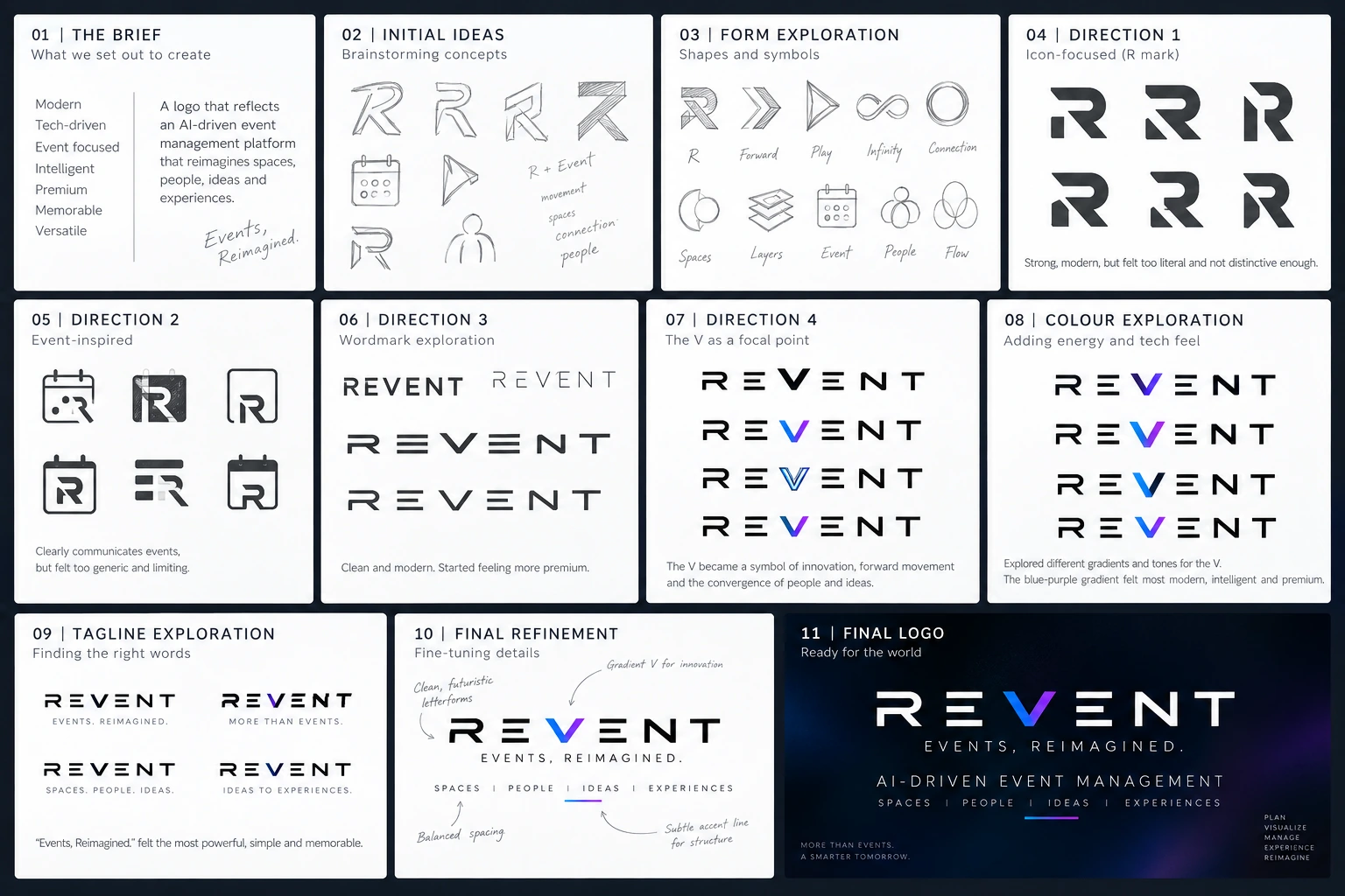
Design exploration board supplied for this case study. It documents the brief, concept sketches, form studies, wordmark directions, colour tests, tagline choices and final refinement.
Translate a modern, tech-driven event platform into a memorable identity that feels premium and versatile.
Explore letterform-based marks alongside visual metaphors for movement, connection, people and event spaces.
Test abstract symbols and familiar event cues. The calendar route communicated the category but felt too generic and limiting.
Shift the emphasis to a custom-feeling geometric wordmark: clean, futuristic and more adaptable across brand touchpoints.
Use the V as a focal point — a visual cue for forward movement, convergence and the meeting of people and ideas.
Fine-tune spacing, letterform consistency, colour balance and the supporting line system for a cohesive final lockup.
The final direction centres on a geometric REVENT wordmark. The V receives a blue-to-violet gradient, creating a focused moment of energy against otherwise restrained monochrome lettering. The result is technical but not cold, distinctive without becoming complicated.
For hero moments, presentations and dark digital surfaces.
For documents, reports, stationery and light UI surfaces.
REVENT Blue (#157EFF) and REVENT Purple (#823EFF) are used together on every illustrative V. The approved logo artwork remains the source of truth for production.
Wide tracking and simple, engineered forms create a clear, contemporary voice. Use the approved logo artwork for the actual wordmark; do not recreate it with live text in production.
Events, Reimagined.
Concise, memorable and broad enough to support the full event journey.
AI-Driven Event Management
Explains the product category clearly, while the tagline carries the brand promise.
The identity is designed to remain recognisable across product interfaces, event communication, pitch decks, social content and physical collateral. Consistent spacing and restrained use of the accent help the brand stay coherent as the platform grows.
Dark UI, clear hierarchy, focused accent colour.
High contrast and a simple lockup for quick recognition.
Flexible use in digital announcements and promotional assets.
Premium, understated framing for strategy and stakeholder decks.
These are illustrative applications for portfolio presentation, not claims of deployed product screens or completed production collateral.
The final identity moves away from literal event iconography and gives REVENT a more ownable visual anchor. The wordmark, signature V accent and supporting language work together as a flexible starting point for a broader brand system.
No quantitative performance metrics or client testimonials were supplied for this project. The outcomes above describe design intent and deliverables, not measured business results.
The case study records the direction and rationale. A production-ready handover should include the approved master artwork and the rules needed to use it consistently.
Primary logo, approved variations, symbol/mark if separately approved, monochrome versions and clear-space guidance.
Colour values, typography recommendations, minimum sizes, background use and incorrect-use examples.
SVG and PDF for scalable use, PNG for digital placement, and production-specific files as required.
Tools, project duration, individual contributors and final export formats were not provided; add confirmed details before publishing as a client-facing record.
REVENT brings event technology and human experience into one clear brand idea: Events, Reimagined.