The ambition
Create a premium, memorable identity that can anchor a broader digital product and brand ecosystem.
From ideas to what’s next. Building a premium visual identity for NUVANTIA — a forward-looking intelligence brand shaped around growth, fluidity, human potential and the meeting of human insight with AI.
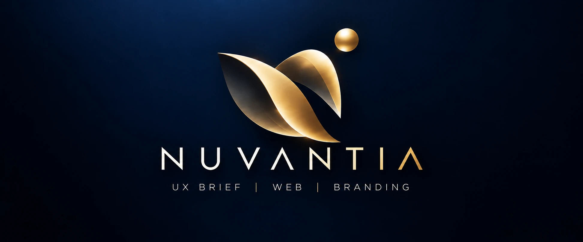
NUVANTIA is positioned as an intelligence-led brand with a future-facing outlook. The identity needed to signal insight and progress without falling into familiar AI clichés: circuit patterns, generic neural nodes or overly literal technology symbols. The chosen direction uses a sculptural, flowing mark and restrained gold-on-midnight contrast to communicate intelligence with a sense of confidence and possibility.
Create a premium, memorable identity that can anchor a broader digital product and brand ecosystem.
Intelligent, modern, fluid, trusted, global and quietly ambitious — premium without feeling inaccessible.
Express growth, forward motion and human-plus-AI thinking through a symbol that remains distinctive and legible across contexts.
Many technology identities compete through sharp geometry, neon gradients and familiar digital metaphors. NUVANTIA needed a more ownable territory — one that could communicate analytical capability while preserving imagination, movement and a human point of view.
The strategy balances two forces: rigorous intelligence and open-ended possibility. The symbol’s layered, ribbon-like form suggests ideas moving around and through one another; the floating sphere acts as a point of focus — a spark, signal or new possibility. Together they give the brand a visual story without locking it to one specific technology.
Help people and organisations move from information toward clearer thinking and meaningful next steps.
A forward-looking intelligence brand that brings insight, creative exploration and technology into one direction.
Thoughtful, fluid, assured, modern, premium and curious about the future.
The design process moved from keywords and mood references into hand-drawn sketches, monochrome digital studies, form refinement, colour explorations and typography testing. The final route preserves the expressive movement of the mark while making the overall lockup feel composed and premium.
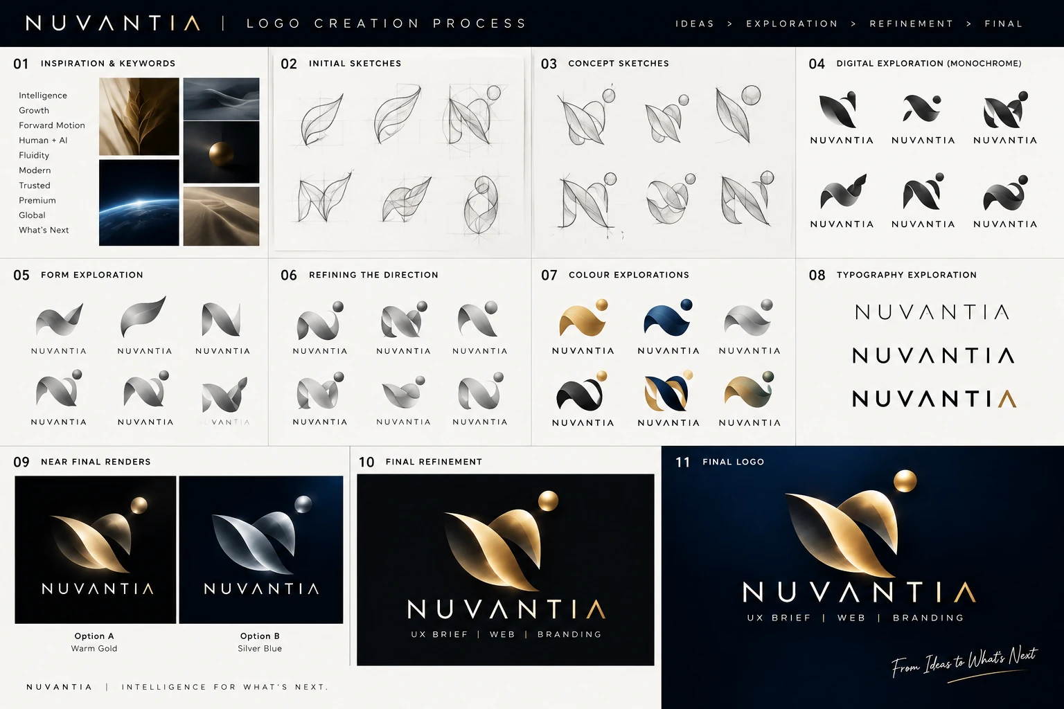
Original NUVANTIA logo process board supplied for this case study.
Establish a visual territory around intelligence, growth, forward motion, human-plus-AI collaboration, fluidity, trust and global ambition.
Explore ribbon, leaf and folded-form gestures, looking for a silhouette that suggests transformation without becoming a literal object.
Combine flowing planes with a separate circular element. Test balance, direction and negative space to find a recognisable overall gesture.
Remove colour to test whether the form holds on shape alone. This helps separate structural strength from the appeal of metallic effects.
Refine the relationship between the curved ribbons and floating sphere, balancing movement with a clear visual centre.
Compare gold, blue, silver and mixed directions. Gold is selected for its warmth, depth and premium quality against midnight navy.
Test wordmark weights, tracking and the treatment of the final letters to create a precise, spacious typographic voice.
Bring the symbol, wordmark and supporting descriptor into one balanced lockup, with careful spacing and contrast.
The final identity pairs a sculptural gold symbol with a widely tracked wordmark. The mark carries movement and metaphor; the typography introduces clarity and structure. The deep navy background gives the metallic gold room to breathe, while the restrained palette keeps the brand from feeling ornamental.
The palette values above are representative digital references sampled from the visual direction. Confirm exact production values against the master brand files before print or product release.
The layered ribbon form can be read as ideas flowing together, a path changing direction, or two forces working in concert. The sphere adds focus and suggests a spark of insight or the next horizon. This is an interpretive design rationale based on the supplied visual, not a claim of a formally approved brand manifesto.
Generous letter spacing creates a deliberate, composed wordmark. The restrained geometry keeps the name contemporary, while the final gold accent provides a small point of distinction. The supplied logo artwork should remain the master for production use.
NUVANTIA’s visual system is designed to move between dark, premium hero moments and quieter information-led surfaces. Consistency comes from protecting the logo proportions, keeping gold as an accent, and letting typography and spacing do the work.
Dark navy creates a premium canvas for the gold symbol and wordmark.
A clean, flat version keeps the identity legible in working documents.
High-contrast lockups support confident, focused storytelling.
The examples are illustrative applications created for this case study, not evidence of deployed collateral.
The final direction moves beyond familiar AI iconography and gives NUVANTIA a more expressive visual anchor. The gold mark, spacious wordmark and midnight palette create a recognisable identity that can support future digital experiences, brand communication and product extensions.
No quantitative brand-lift data, audience-test results or client testimonials were supplied. The outcomes above describe design intent and visual deliverables, not measured business impact.
A production-ready handover should include the approved master artwork and a concise rule set so the brand stays consistent when it moves between people, platforms and formats.
Primary lockup, symbol-only version if approved, light and dark variants, monochrome versions and vector masters.
Clear space, minimum size, approved backgrounds, contrast guidance and examples of incorrect use.
Confirmed HEX, RGB, CMYK and print values; typography recommendations; and export formats for web and print.
Project timeline, software tools, contributor credits and final export formats were not provided. Add verified details before publishing this case study as a formal client record.
NUVANTIA — an identity for intelligence, movement and the possibilities ahead.