Brand identity · Logo design case study

Ideas take shape.
Meaning finds
its mark.

A visual identity for Kiln & Cadence — built around the meeting point of human creativity, AI-enabled production, craft, rhythm and collaboration.

Strategy-led designSymbol explorationIdentity system
Kiln & Cadence final logo, metallic ivory and bronze ampersand within a circular time-mark
01 / THE PROJECT

A mark for the space between idea and execution.

Kiln & Cadence brings strategy, design, technology and production together. The identity needed to feel considered and premium without losing the energy of a modern, AI-enabled creative studio.

The brief

Create a memorable, timeless and contemporary identity that communicates creative thinking, technical capability and the human collaboration that brings work to life.

  • Creative, modern and premium
  • Human + AI, working together
  • Craft, technology and production
  • Distinctive and adaptable across digital touchpoints

The design challenge

Represent several disciplines without resorting to literal icons or a crowded symbol. The identity had to feel like one coherent studio, not a collection of unrelated services.

  • Unify varied capabilities under one brand
  • Make the ampersand a meaningful central device
  • Balance warmth and precision
  • Keep the core mark recognisable at different sizes
“For every digital creative. Powered by AI. Crafted by humans.”

The line captures the intended relationship: technology extends creative possibility, while human judgment gives the work purpose, character and finish.

02 / STRATEGY

One identity. Multiple disciplines. Shared intent.

The concept is grounded in the brand’s name: the kiln as a place of transformation, and cadence as rhythm, timing and the steady progression of work.

Kiln — transformation

A metaphor for ideas being shaped, tested and refined through craft. It signals care in the making, not just speed of output.

Cadence — rhythm

A sense of pace, sequence and momentum: the movement from first thought to considered delivery, with people and tools working in sync.

The ampersand — togetherness

The “&” is the natural centre of the identity. It connects strategy and design, human and AI, imagination and implementation.

The circular time-mark — continuity

The surrounding rhythm of ticks suggests time, focus and iteration. It frames the symbol as a meeting point of creative energy and considered process.

CreativeModernHuman + AICraft + technologyTogethernessPremiumTimeless
03 / DESIGN PROCESS

From rough thought to a resolved mark.

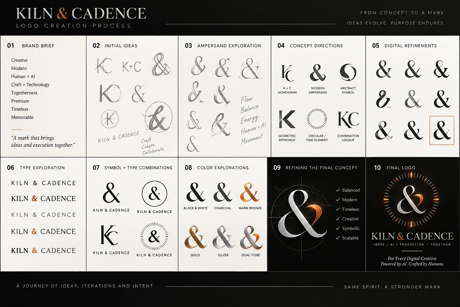
The process board documents the progression from the brief and early sketches through ampersand studies, concept directions, typography and colour explorations, refinement, and the final logo.

Kiln & Cadence logo creation process board showing ten stages from brief and initial sketches to final logo

Original logo creation process board supplied for this case study.

01 — DEFINEEstablish the values, tone and intended brand impression.
02 — EXPLORESketch initial letterforms, monograms and ampersand ideas.
03 — COMPARETest abstract, typographic and circular-symbol directions.
04 — REFINEDevelop balance, proportions, type pairing and colour.
05 — RESOLVEBring symbol, wordmark and supporting line into one lockup.
04 / THE IDENTITY

Quiet confidence, with a spark of energy.

The final lockup combines an expressive ampersand, a circular rhythm of fine marks, a refined serif wordmark and restrained supporting typography.

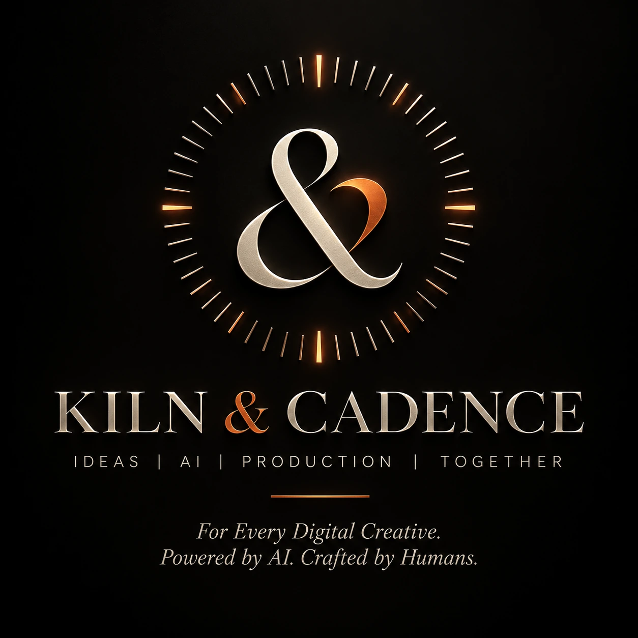
Full Kiln & Cadence logo lockup on a dark background

01. The symbol

The flowing ampersand is the focal point. Its intertwined forms create movement and connection, while the contrasting metallic tones give the symbol depth and distinction.

02. The circular frame

Fine radial ticks create a sense of rhythm and measured progression. Four brighter markers establish emphasis without overwhelming the central symbol.

03. The wordmark

High-contrast serif lettering adds a crafted, editorial character. Generous spacing supports a premium impression and gives the name room to breathe.

04. The descriptor

“IDEAS | AI | PRODUCTION | TOGETHER” makes the studio’s connected capabilities explicit, balancing the expressive emblem with a clear, practical message.

Colour direction

The following swatches are visual approximations sampled as a practical starting point from the supplied artwork—not official colour values. Final production values should be confirmed against the master logo files.

Kiln Black#0B0B0A · Grounding
Warm Ivory#EEE7DC · Clarity
Burnished Bronze#D97832 · Energy
Soft MetallicIvory / silver tones · Craft
KILN & CADENCE
Ideas  |  AI  |  Production  |  Together

Typography direction: a refined, high-contrast serif for the primary wordmark, paired with a restrained sans-serif for descriptors and small supporting text. Use the original licensed typeface or approved outlined artwork for production.

05 / BRAND IN USE

Designed to travel beyond the hero image.

A strong identity must remain clear across different contexts—not only in a large, dramatic presentation. These are suggested application directions for the system, not claims that these mockups have already been produced.

K&C
Digital presence
Website · Portfolio · Decks
K&C
Social identity
Avatar · Channel · Profile
KILN & CADENCE
Studio collateral
Proposals · Documents
Glowing amber radial ring symbol replacing the star
Motion identity
Intro · Outro · Reveal
K&C
Favicon and small mark
Browser · App · UI
KILN & CADENCE
Print and presentation
Cards · Reports · Signage
Practical recommendation

Create a simplified flat version for small sizes and reproduction methods that cannot preserve metallic gradients. Keep the detailed, dimensional artwork for large-format and premium digital uses.

06 / USAGE PRINCIPLES

Protect the mark by using it with intention.

A consistent identity depends on clear rules for contrast, spacing, scale and background treatment.

Do

  • Use the approved full lockup where space allows.
  • Give the logo generous clear space.
  • Use a high-contrast, uncluttered background.
  • Use a simplified mark for tiny placements.
  • Keep the wordmark and descriptor proportions intact.

Avoid

  • Stretching, skewing or independently resizing logo parts.
  • Adding unapproved shadows, outlines or colours.
  • Placing the detailed logo over busy imagery.
  • Using the full detailed lockup at unreadably small sizes.
  • Recreating the wordmark with a substitute font.
07 / HANDOFF

A logo becomes a system when it is ready to use.

The supplied visuals establish the primary logo and its design journey. The checklist below identifies the supporting assets to prepare for a complete, production-ready handover.

Primary full-colour logo
Transparent PNG export
Vector master: SVG / PDF / EPS
Light and dark background variants
One-colour black and white variants
Simplified symbol and favicon set
Approved colour values for digital and print
Typography names and licence notes
Clear-space and minimum-size guidance
Usage examples and brand mini-guide

This is a recommended handover checklist, not a statement that every listed file is included with the two supplied images.

The result

A distinctive mark for connected creativity.

The Kiln & Cadence identity brings craft and technology into one visual language: an ampersand for collaboration, a circular rhythm for cadence, and a refined wordmark for confidence. It expresses the studio’s belief that strong work is made when ideas, tools and people move together.