The brief
Create a contemporary, memorable logo for GENVYN, positioned as a brand-journey identity. The mark needed to feel modern, premium, adaptable, and connected to growth.
Building a distinctive identity for GENVYN — a brand journey concept designed around transformation, forward movement, and the moment an idea becomes a recognisable brand.
GENVYN · Brand Journey
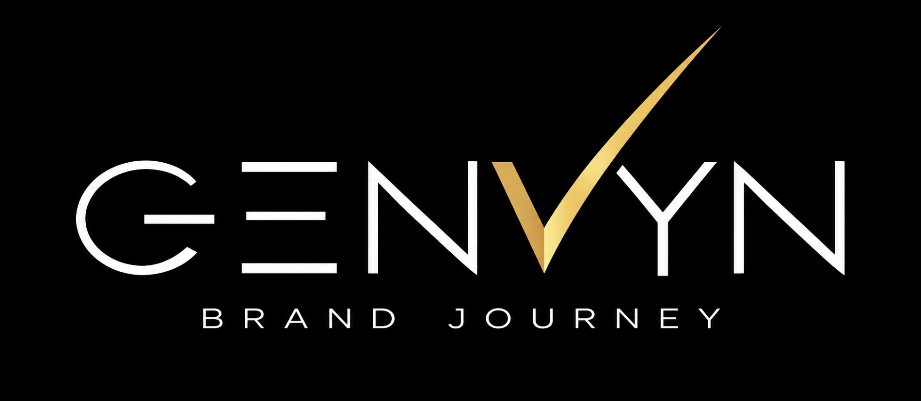
A visual identity created to express progress without losing clarity: a modern wordmark, a purposeful upward gesture, and a premium gold accent that makes the journey feel tangible.
Create a contemporary, memorable logo for GENVYN, positioned as a brand-journey identity. The mark needed to feel modern, premium, adaptable, and connected to growth.
Combine a clean geometric wordmark with a meaningful symbol without making the identity feel crowded, overly literal, or difficult to reproduce across digital touchpoints.
Use restrained typography as the stable foundation, then introduce an ascending gold stroke through the “V” area to communicate movement, momentum, and transformation.
The identity is built around the idea that a brand is not created in a single moment. It develops through choices, refinement, trust, and forward motion.
GrowthTransformationTrustModernPremiumMemorableFuture-ready
The upward stroke acts as a visual shorthand for progress: a mark that rises from the wordmark and suggests a journey from an early idea toward a stronger, more defined brand.
The supplied process board documents the evolution from brand brief and hand-drawn exploration to wordmark refinement, colour studies, construction, and the final identity.
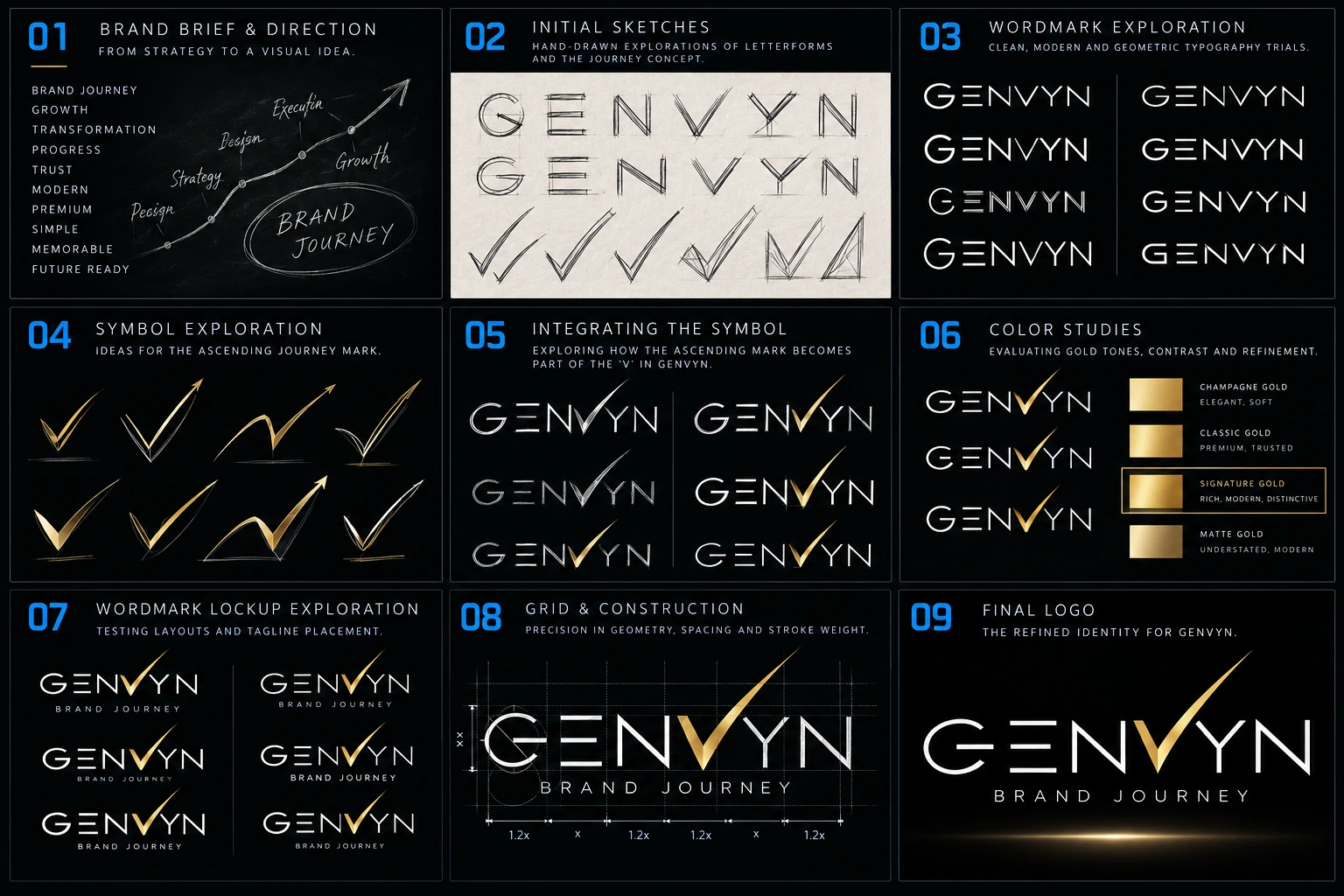
Original GENVYN design journey board supplied for this case study. The board is presented as the visual record of the exploration process.
Each element has a distinct job. Together, they create a modern identity that is minimal at first glance and meaningful on closer inspection.
The open, linear letterforms give GENVYN a clean, engineered feel. Wide spacing supports a confident, contemporary presence and helps the name breathe.
The gold stroke rises beyond the wordmark baseline, creating the signature moment. It can be read as a path, a check of progress, or an upward trajectory.
The letter-spaced descriptor explains the broader brand idea while remaining visually secondary. It adds context without weakening the main name.
Primary presentation — dark background, white wordmark, gold signature stroke.
Reverse / light-surface adaptation — use an approved light-background artwork variant for light surfaces; do not simply place the dark master image on white.
The palette below follows the supplied GENVYN logo: a confident black foundation, crisp white wordmark, and signature gold ascending “V”. Values are practical digital approximations; confirm exact production values against the approved master artwork before print or fabrication.
#05080D#F4F7FB#E9BD57#AAB7C7Use gold as an accent, not a flood colour. Keep the majority of the composition dark or neutral so the signature stroke retains its distinctiveness.
Recommended applications extend the identity into a coherent brand system. These are proposed use cases, not a claim that finished assets have already been produced.
Website header, landing-page hero, social profiles, email signatures, and branded presentation covers. Use the full lockup where context is needed and a simplified mark where space is limited.
Strategy decks, brand discovery documents, visual identity presentations, and client-facing progress reports. Keep the gold stroke consistent and avoid adding competing accent colours.
A restrained animation could trace the upward stroke, settle the wordmark into place, then reveal “Brand Journey”. Keep movement purposeful and brief.
Use a dark, uncluttered field for profile and announcement graphics. Preserve safe margins so the upward point is not cropped in square or vertical placements.
For business cards, stationery, signage, or packaging, prepare vector masters and a production-approved gold treatment. Avoid relying on raster glow effects for small print.
For favicons and tiny placements, create a dedicated simplified symbol or initial-based asset. The complete wordmark and descriptor may become illegible at very small sizes.
A logo is only as strong as its consistency. These recommendations help preserve the identity across different teams, channels, and production formats.
To make the identity production-ready for the client, the following assets should accompany the final visual.
This case study documents the supplied design exploration and the rationale that can be read from it. Exact typeface names, final vector specifications, formal clear-space measurements, and print colour conversions should be confirmed from the editable source files before production.
GENVYN’s identity turns the idea of a brand journey into a recognisable visual signature: a precise wordmark, a rising gold gesture, and a descriptor that grounds the concept.
Created by Kiln & Cadence · Ideas, AI, Production, Together.